History is all about context. Usually this means the wider circumstances, including what lead up to the events we study and the mental word of the people we seek to understand. But it has a physical aspect too – the material objects that surround people, shaped by and shaping the culture of which they are a part.
Take, for example, the letterhead – the pre-printed part of a piece of stationary that gives the sender’s name, address and other information. Any archivist or scholar who goes through hundreds or thousands of letters will find amazing variety in this simple device.
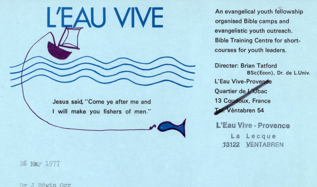
Some state their data with clipped simplicity, some overflow with the sender’s beliefs, principles, mottos, and images to such a degree that they easily dominate whatever sentences can be squeezed into the remaining white space of the page.
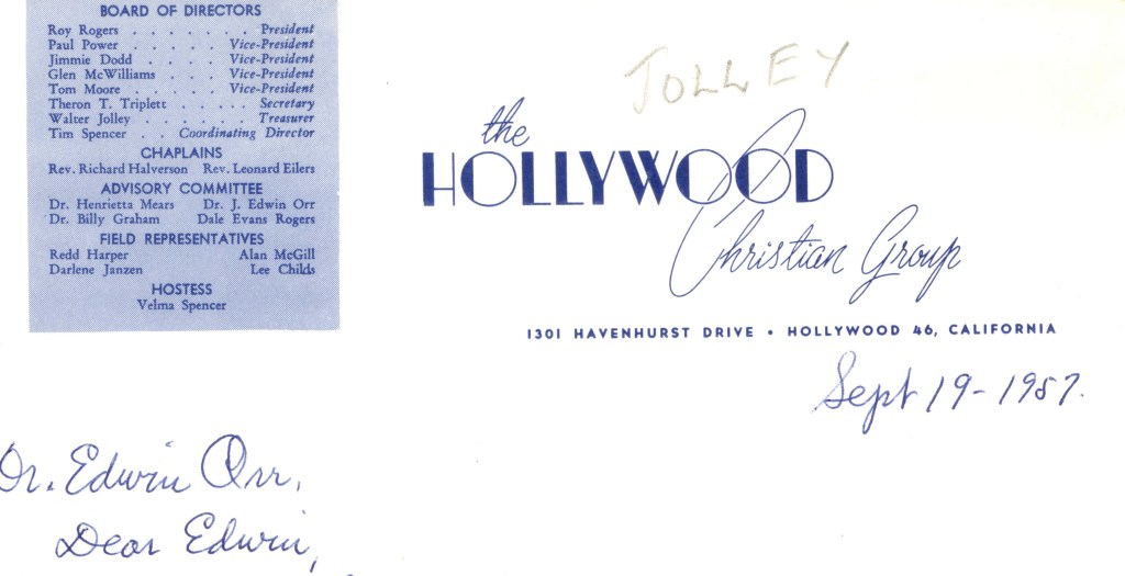
The ability of the physical page to communicate as well as the words upon it is illustrated by the correspondence of J. Edwin Orr (1912-1987). In 2020, the Archives opened Collection 355, the papers of Orr, an influential evangelist and scholar who exchanged thousands of letters worldwide with people over half a century of ministry. What he and his correspondents wrote to each other is fascinating, insightful, and instructive. But what they wrote upon, the stationary itself, can also be charming, illustrative, and sometimes weird, quietly (or not so quietly) conveying its own message and tone.
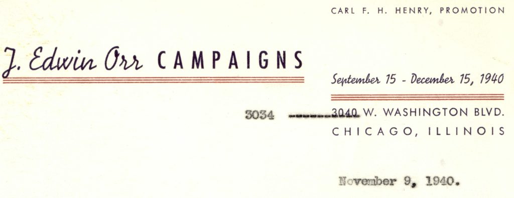
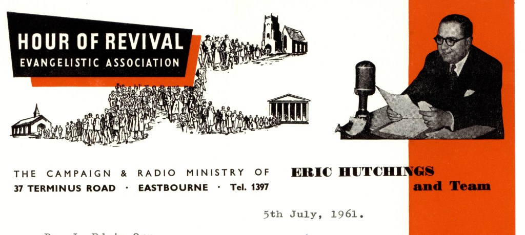
Orr’s own letterheads were simple and straightforward, as in the sample to the left from one of his Chicago campaigns. Note however, the mistaken address, perhaps an error on the part of his distinguished promotion manager.
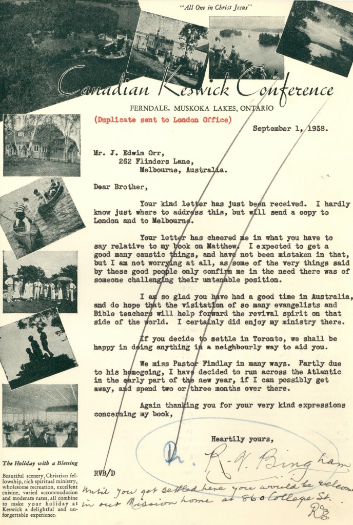
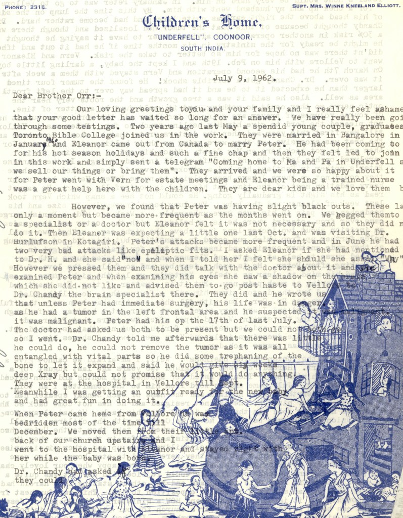
The folks at the Canadian Keswick Conference, on the other hand, were reluctant to leave out any detail or image which might cause someone to sign up for “The Holiday with a Blessing” while those at the Children’s Home felt their graphic was meaningful enough to give it much of the page.
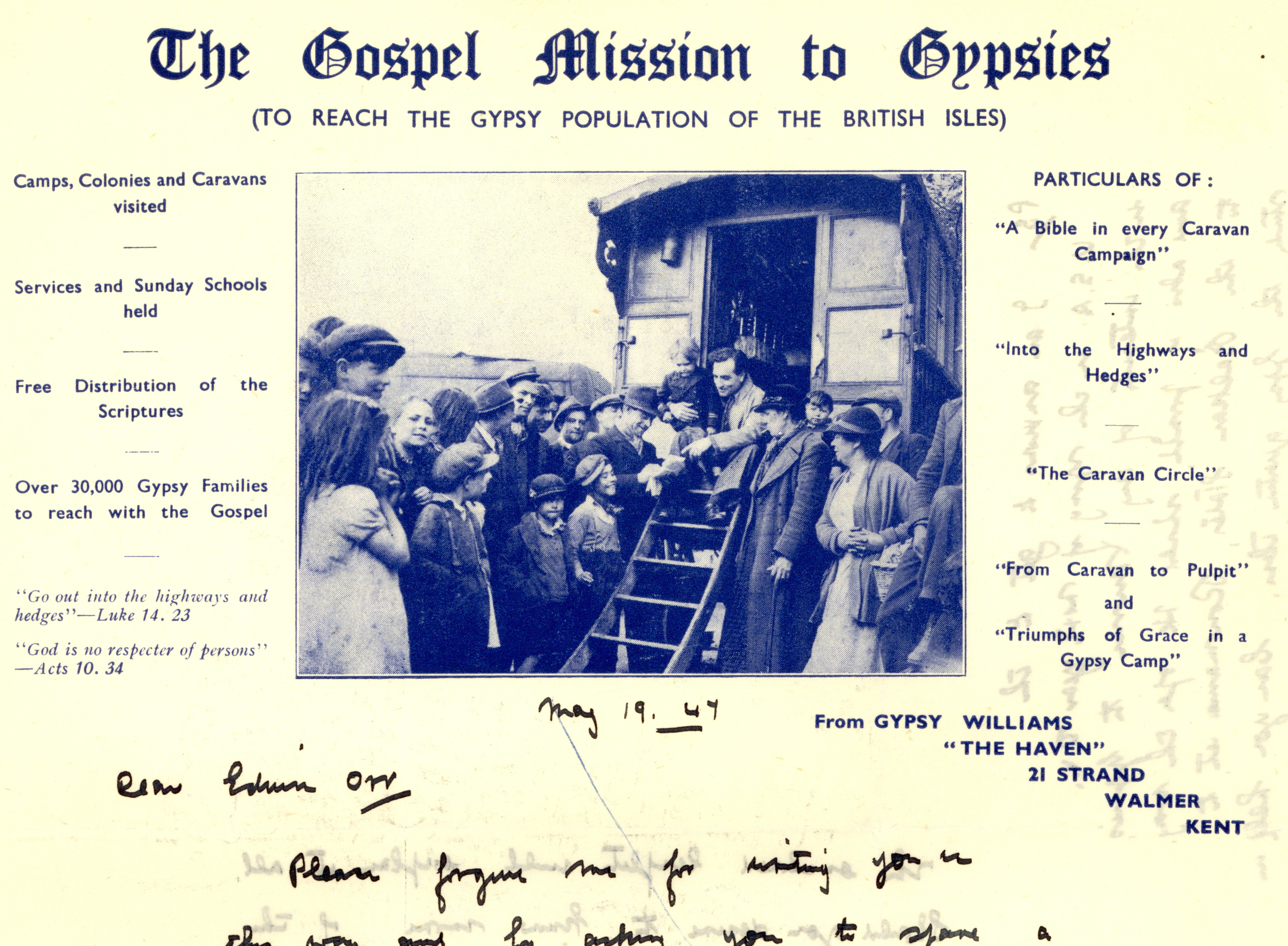
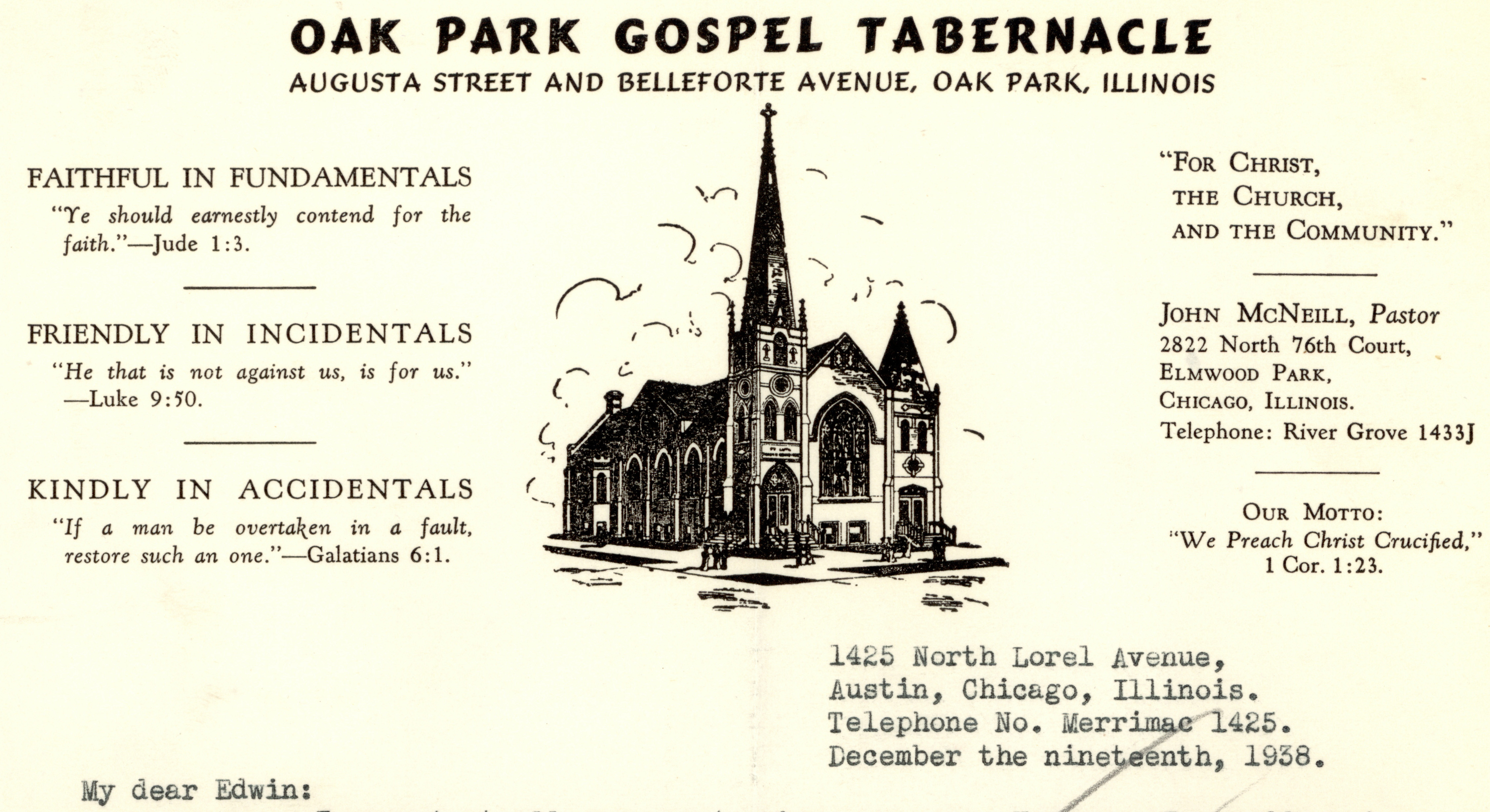
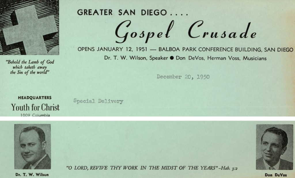
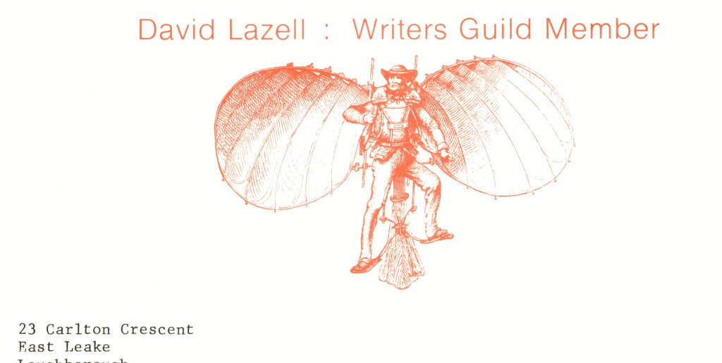
Reviewing the wealth of examples in Orr’s correspondence, the possible variety in form and design for letterheads is as endless as the personalized contents. Some organizations, like the Gospel Mission to Gypsies and the Oak Park Gospel Tabernacle were content to cram as much information as they could onto the top of the page while the Greater San Diego Gospel Crusade and others left the sides of the stationary alone but made full use of both the top and bottom. Still other correspondents used familiar fonts or clever graphics to make their point. Individuals, as opposed to organizations, also found ways to make their letters unique.
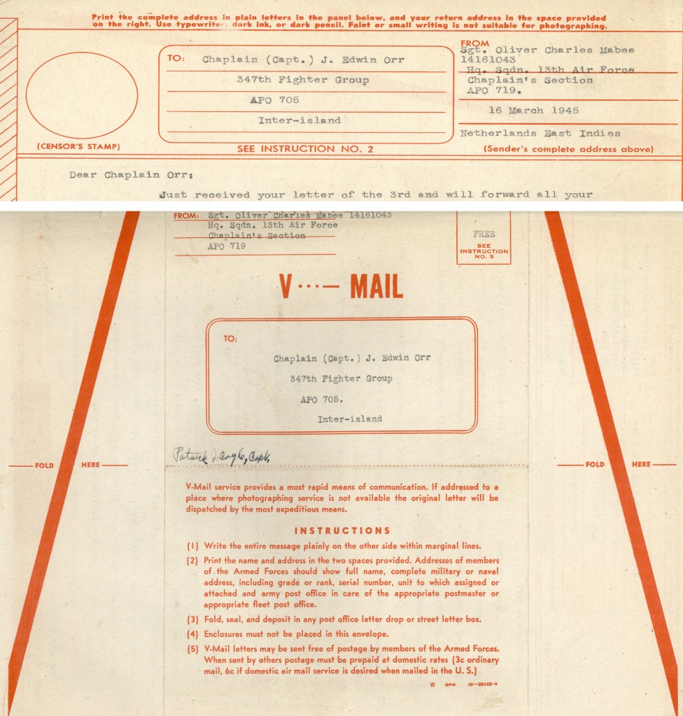
It wasn’t always the graphics or text on the front of the form that conveyed a message. Orr was a chaplain in the United States Air Force during World War II. Like millions of others in the military, he used V-Grams to send and receive mail.
To send a V-Gram, the sender would take a printed V-Mail (V for Victory) form and write his message on one side and the address on both sides. The letter was then sent to a military facility, where it was microfilmed with thousands of other messages. Crossing oceans or the wide American plain in this consolidated format, the microfilm ended its journey at another location, where each frame was enlarged, and the messages sent to their recipients. This greatly reduced the weight that the military had to ship via plane during the war.
Below is one of the V-Mails that Orr received during the war, with a small portion of the front and all of the back, where the military listed the detailed instructions for using this wartime mail innovation.
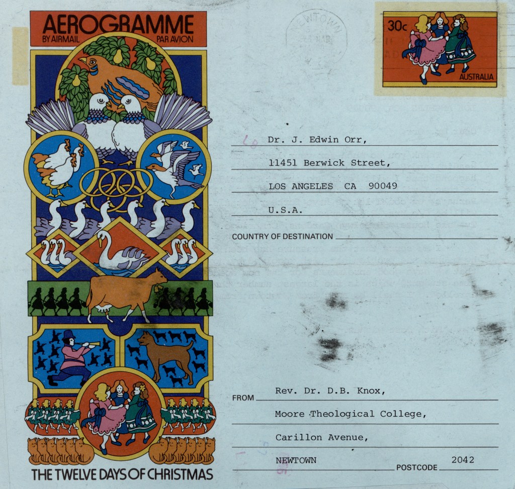
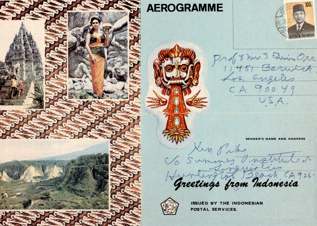
Another common letter construction was the aerogramme. Aerogrammes were airmail forms on which you wrote on one side, then sealed up the letter and mailed it. The back of the aerogramme, which contained the address, could be used to convey a Christmas message, or show local culture.
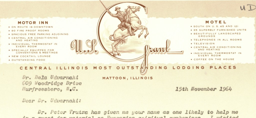
Last and decidedly not least is the one below, greatly beloved by the WCBGC Archives staff, the letterhead showing our usually taciturn 18th president gallantly leading his troops into battle for the greater glory of the U.S. Grant Motel and Motor Inn, Central Illinois’ Most Outstanding Lodging Places.

Emily, great article! What a brilliant idea for a deeper dive. Funny, but also fascinating from a social-history point of view. (Who knew about V-grams? ) Thanks.
LikeLike